Point-of-sale communication is often misunderstood as a final-stage tactic, when in reality it plays a decisive role in how customers feel, decide, and act in the last moments before purchase. Small display cards are among the most effective yet underestimated tools in this space. Compact, direct, and strategically positioned, they work quietly to guide attention and reinforce decisions without overwhelming the customer.
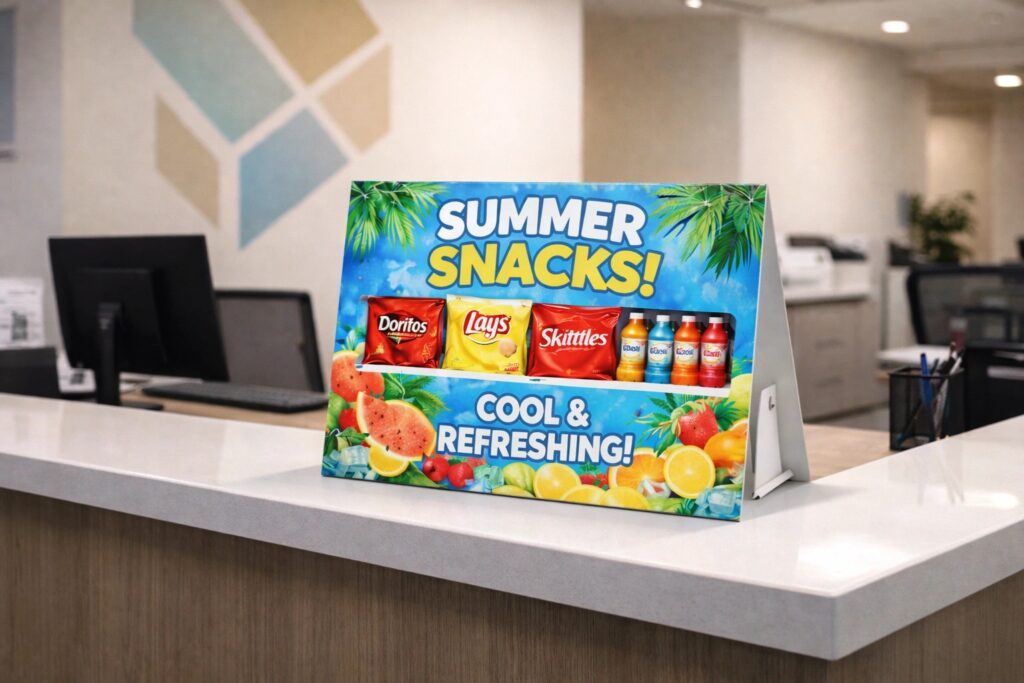
In modern retail environments where visual noise is constant, clarity becomes a competitive advantage. This is where a well-designed strut card earns its place. It does not shout. It informs, reassures, and nudges at precisely the right moment. When executed properly, these small formats deliver outsized influence on engagement and conversion.
Retail psychology shows that customers make many decisions in-store rather than beforehand. These decisions are often shaped by subtle prompts rather than overt persuasion. Small display cards operate within this behavioural window.
Their effectiveness lies in three key qualities:
Because they are seen at close range, these cards benefit from careful typography, strong contrast, and restrained messaging. A single clear benefit or instruction often outperforms multiple competing messages.
Although often associated with offers or prices, small display cards serve many operational purposes that improve the overall retail experience.
Clear guidance reduces hesitation. Messages such as product suitability, guarantees, or usage tips help customers feel confident in their choice.
At tills and service points, small cards help manage expectations, communicate policies, or explain next steps, reducing friction during busy periods.
Even at a small scale, consistent colour, tone, and material reinforce brand professionalism. These details accumulate to shape perception.
A strut card placed at the right height and angle ensures the message remains visible without interrupting movement or staff interaction.
Designing for small formats requires a different mindset than large signage. Every element must earn its place.
| Design Element | Practical Impact |
| Font size | Must remain legible at arm’s length |
| Colour contrast | Ensures visibility under varied lighting |
| Material rigidity | Maintains upright position throughout the day |
| Message hierarchy | Guides the eye to the primary action or benefit |
Overdesign is a common mistake. Decorative elements should never compete with the message itself. The goal is instant comprehension, not visual novelty.
Clear, purposeful communication is not exclusive to retail. It is equally critical in complex physical environments where people need to navigate information quickly and confidently.
For example, construction companies cardiff operate in settings where clarity, safety, and trust are non-negotiable. On active sites or during refurbishment projects, signage must communicate instructions, progress, and reassurance without ambiguity. The same principle applies at the point of sale: when information is clear and well-positioned, people move forward with confidence.
This parallel highlights an important truth. Whether guiding a customer to complete a purchase or helping occupants understand a changing space, effective communication respects attention and context.
Even the best-designed card fails if placed poorly. Successful placement considers natural eye lines, customer movement, and dwell time.
High-performing locations include:
Rotating messages seasonally or in response to customer behaviour keeps the content relevant. However, consistency should not be sacrificed for novelty. Familiar formats build recognition and trust.
Using a strut card consistently across multiple touchpoints reinforces brand discipline while allowing message flexibility.
Small display cards are measurable tools when used thoughtfully. Retailers can assess effectiveness by tracking:
Because production costs are relatively low, testing variations in message or placement is both practical and insightful. Incremental improvements compound over time.
Durability matters. Cards that bend, fade, or topple quickly undermine professionalism. Choosing appropriate substrates extends lifespan and reduces waste.
Reusable formats allow message inserts to be updated without reprinting entire units, aligning with more responsible production practices while maintaining visual quality.
Small display cards succeed not because they are eye-catching, but because they are respectful of attention. They work best when they clarify rather than persuade, support rather than distract. In a retail landscape increasingly shaped by speed and choice overload, the quiet confidence of a well-placed message can be the difference between hesitation and action.
When communication is treated as a functional design discipline rather than an afterthought, even the smallest surfaces become powerful contributors to engagement, trust, and long-term brand strength.
© 2026 Point of Sale Printers. All Rights Reserved.