Retail environments reward calm guidance more than loud persuasion. Shoppers rarely notice the subtle prompts shaping how they move, pause, or reach, yet these cues steadily influence what ends up in the basket. Side-shelf graphics sit within this quiet layer of control. They do not interrupt decision-making but support it, helping customers orient themselves without breaking rhythm. When designed with intent, these small interventions align movement, attention, and choice into a pattern that feels natural rather than directed.
Shoppers read space instinctively. Eye level, peripheral movement, and the rhythm of shelving all communicate information long before price or copy is processed. Side-shelf graphics operate within this peripheral zone, offering directional hints rather than instructions.
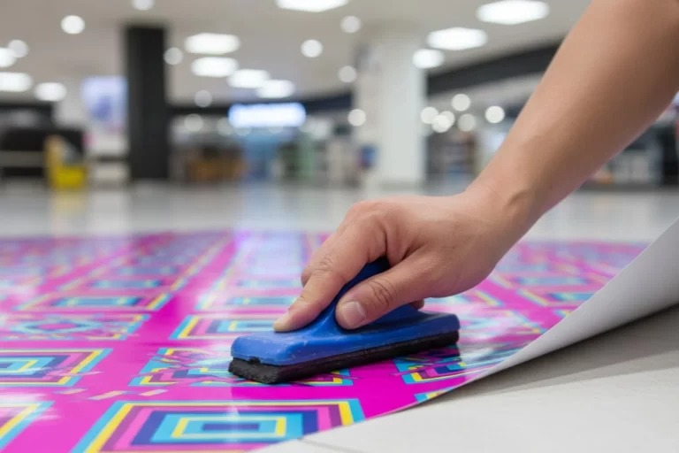
Placed at the right height, aisle fins catch lateral vision as shoppers move forward. The effect is not to stop traffic but to suggest a momentary adjustment in pace or gaze. This matters because product choice often occurs during these brief pauses rather than at the shelf itself.
Unlike overhead signage, which frames an area broadly, side-shelf elements work at human scale. They respond to walking speed, trolley width, and line of sight, making them effective in narrow or busy aisles where decision windows are short.
Each moment is brief, but together they influence flow and confidence. The goal is not to redirect behaviour sharply but to smooth it.
Effective use of aisle fins depends on coordination between merchandising, layout, and stock logic. When graphics are added without this alignment, they risk becoming visual noise.
Well-planned placement considers:
Used this way, aisle fins act as extensions of the shelf rather than add-ons. They become part of the navigation system, not decoration.
One persistent assumption is that more graphics equal more impact. In reality, density often weakens effectiveness. When every shelf edge competes for attention, none succeed.
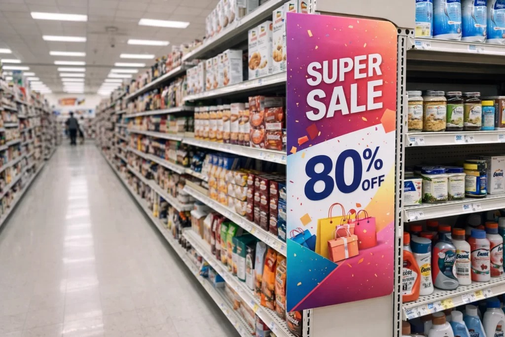
Another misunderstanding is treating side-shelf elements as purely promotional. Their strength lies in orientation and reassurance, not urgency. Overloading them with offers or complex copy shifts their role and disrupts flow.
Finally, some retailers expect immediate, measurable spikes from these graphics alone. Their influence is cumulative. They shape behaviour over repeated visits, building familiarity that supports long-term choice patterns rather than short-term reaction.
| Guidance approach | How it influences behaviour | Typical outcome |
| Overhead signage | Sets broad expectations | Category awareness |
| Shelf talkers | Interrupt decision-making | Short-term promotion |
| Side-shelf graphics | Support movement and focus | Confident selection |
| Floor markers | Control direction | Managed traffic flow |
This comparison highlights why side-shelf graphics occupy a unique role. They sit between navigation and persuasion, offering clarity without interruption.
Over time, consistent visual cues create familiarity. Shoppers learn where to look and how to move through a store with minimal effort. This efficiency builds comfort, which in turn supports loyalty.
Aisle fins contribute to this by reinforcing category structure visit after visit. Even when specific messages change, the presence of a familiar visual anchor reassures shoppers that the environment is predictable and manageable.
This effect mirrors how well-run clinics use consistent systems to guide patients smoothly from waiting room to consultation. The environment does not demand attention; it earns trust through reliability.
Retail history shows that not every message benefits from scale. Large-format advertising has its place, particularly outdoors, where hoardings
rely on distance and repetition to embed recognition over time. Inside a store, however, the conditions are different. Space is compressed, attention is fragmented, and decisions are immediate.
This restraint reduces cognitive load. Shoppers do not feel guided; they feel supported. The distinction is subtle but critical for trust.
The most effective side-shelf graphics often feel understated. Neutral colours, concise wording, and clear iconography outperform loud designs in busy retail spaces.
Designing for restraint requires confidence. It assumes that shoppers are capable and attentive when supported correctly. Retailers who embrace this approach tend to see steadier engagement rather than spikes followed by fatigue.
When aisle fins are treated as part of the store’s visual grammar, they contribute to a coherent experience rather than isolated messages.
Side-shelf graphics shape behaviour by guiding context rather than demanding attention. Their effectiveness comes from careful timing, precise placement, and steady repetition, not from size or visual force. When they are integrated into the retail environment with intent, they help shoppers move smoothly, notice relevant options, and feel assured in their choices. Within Point of Sale settings, this quiet influence is significant, turning routine movement into an organised journey where decisions feel natural, familiar, and well supported.
© 2026 Point of Sale Printers. All Rights Reserved.