Checkout is not a neutral space. It is the final environment where decisions settle, hesitation appears, and value is either reinforced or questioned. Shoppers arrive with intent, yet the last few seconds determine whether that intent converts cleanly or fragments. The materials surrounding a till influence pace, confidence, and perception far more than many retailers realise. Print elements positioned here do not shout; they quietly frame judgement, shaping what feels reasonable to buy and what feels easy to ignore.
By the time a shopper reaches the till, cognitive load is already high. Choices have been made, baskets filled, and attention narrowed. At this point, clarity matters more than persuasion. Print at checkout works best when it removes uncertainty rather than adds information.
Retailers often underestimate how small visual cues anchor value. A neatly aligned price strip or a concise message beside a payment terminal can stabilise decision-making. This mirrors how UK clinics use calm, consistent visual cues to reassure patients before treatment confirmation—clarity reduces resistance. The checkout threshold functions the same way: it either supports completion or introduces friction that delays action.
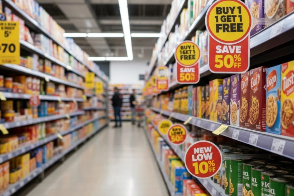
Poorly considered print can undermine trust. Cluttered notices, mismatched colours, or inconsistent messaging interrupt flow and raise doubt. Shoppers may pause to re-check prices or question promotions they had already accepted.
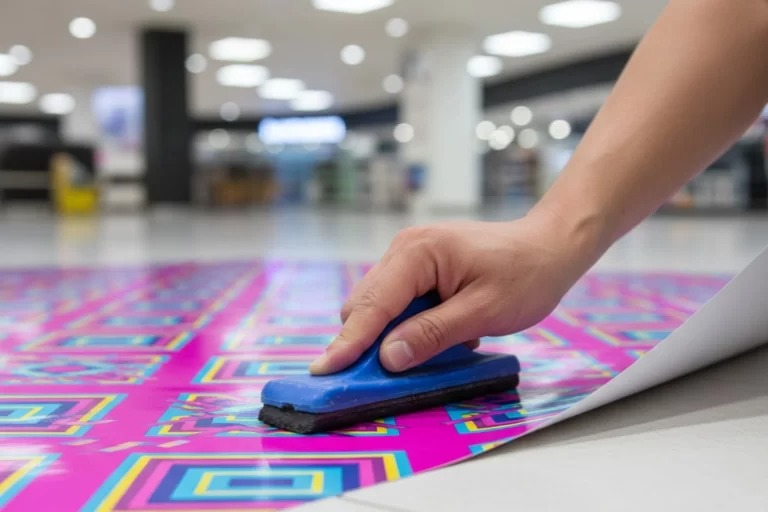
In this context, pos printing becomes a discipline rather than a decorative choice. When applied without structure, it creates noise. When controlled, it acts as a stabiliser. The risk lies in assuming more messages equal more influence. At checkout, restraint often outperforms volume, especially when queues form and patience thins.
Small interventions work best when ordered logically. At checkout, the sequence matters more than the message itself.
This sequence allows pos printing to function as a behavioural guide, not a sales push. Each step respects the shopper’s existing commitment rather than challenging it.
Several assumptions persist, often inherited from broader in-store marketing habits:
At checkout, these assumptions frequently fail. Shoppers are less receptive to novelty and more sensitive to disruption. Print that succeeds here often looks understated, even unremarkable, because its purpose is to support completion, not initiate exploration. The effectiveness of pos printing at this stage lies in its ability to disappear into the process while still doing its job.
Some retailers rely on dense clusters of notices around the till. Others apply a lighter touch. The difference is not aesthetic preference; it is behavioural outcome.
Subtle guidance respects the shopper’s narrowed focus. It reinforces decisions already made. Visual overload competes with the act of paying, increasing hesitation. In high-traffic environments, the latter often leads to longer queues and reduced goodwill.
This contrast becomes clear when observing how long shoppers take to complete payment. Where print is restrained and consistent, transactions move with fewer interruptions. Where it overwhelms, staff intervention rises.
| Checkout Element | Primary Influence | Behavioural Effect |
| Price confirmation strip | Reassurance | Reduces last-second doubt |
| Small add-on prompt | Convenience | Encourages low-effort extras |
| Payment instruction card | Clarity | Speeds transaction flow |
| Collection or bagging cue | Closure | Signals completion |
This table highlights that influence is tied to function, not persuasion. Each element serves a specific role in guiding behaviour without demanding attention.
Effective checkout print focuses on continuity. It echoes what the shopper has already seen, rather than introducing new ideas. This alignment reduces mental recalculation.
A useful way to think about this is through operational parallels. A signage companies installing directional signage in a complex building prioritises legibility and placement over artistic flourish. The goal is movement without confusion. Checkout print follows the same logic: guide, confirm, and conclude.
Retailers who treat this area as an operational junction rather than a marketing billboard tend to see smoother transactions and fewer abandoned add-ons.
Over time, inconsistent checkout environments train shoppers to hesitate. Even loyal customers begin to double-check prices or question promotions if visual cues vary from visit to visit. This erosion of confidence rarely shows up immediately but accumulates quietly.
Retailers who maintain disciplined checkout print systems often see fewer staff interruptions and more predictable basket behaviour. The space becomes dependable. In this sense, pos printing contributes to operational reliability as much as to sales performance.
At checkout, influence is built through calm structure rather than overt persuasion. Print elements that quietly guide attention, confirm value, and signal completion help shoppers feel confident while keeping transactions moving smoothly. When checkout materials are treated as an integrated part of the retail system, rather than an afterthought, the space becomes more predictable and easier to manage. For retailers working with Point of Sale, consistency at the till reinforces trust, reduces hesitation, shortens queues, and subtly shapes buying decisions without demanding extra focus from customers.
© 2026 Point of Sale Printers. All Rights Reserved.